CASE STUDY — 2019

Reebee's
Onboarding
Strategy

With all new product experiences, including an onboarding process is essential to the retention of your users. During my internship at Reebee, I was tasked with creating a brand-focused, cohesive onboarding process that oriented around our app’s value proposition, which is now implemented on all their mobile platforms.
TEAM
1 product manager
3 developers
1 product designer (me)
MY ROLE
Visual design
Illustration
User flows
Market research
DURATION
May 2019 - July 2019

What's the problem?

Reebee’s onboarding process hadn’t been updated in over 5 years, leading to low retention rates, lack of branding, and several unused features.

Design challenge

How might we increase the app retention rate and emphasize a first time user's understanding of reebee?

SOLUTION
I designed a 3 part onboarding strategy to engage first time users on our application. We employed in-app tooltips, a full screen walkthrough, and empty state screens to educate users and display a brand voice.

The end product emphasizes Reebee’s main selling parts to demonstrate how our app will improve their lives.
APPROACH
To build an onboarding strategy, I evaluated the current onboarding process of the reebee application and consulted several online resources on building mobile product tours. I collaborated with our customer success team to evaluate our strongest features.
Final Design Interactive Prototype

Current progress

As of February 2020, the full-screen walkthrough and the tooltips have been implemented on all of Reebee’s mobile platforms (Android and iOS) to their 1.2 million users.

Design process

Previous solution

Previous Reebee onboarding flow
At the beginning of the project, I analyzed the UX issues of the existing Reebee onboarding flow to see what could be improved.
Absence of location priming
Users are prompted immediately for location permissions, decreasing their control and removing app transparency
Lack of brand personality
Little to no brand personality throughout the process, which is key in building user relationships with your app
Intrusive tooltips
The tooltips were placed at key discovery points in the app but disrupted the workflow, creating friction for users

Gathering research

Identifying Reebee’s value proposition was key to showcasing features within the newly created onboarding process. The key insights to our research were aimed at identifying Reebee’s value proposition from our users’ perspective and understanding our user demographic to better approach the problem we were solving for them.

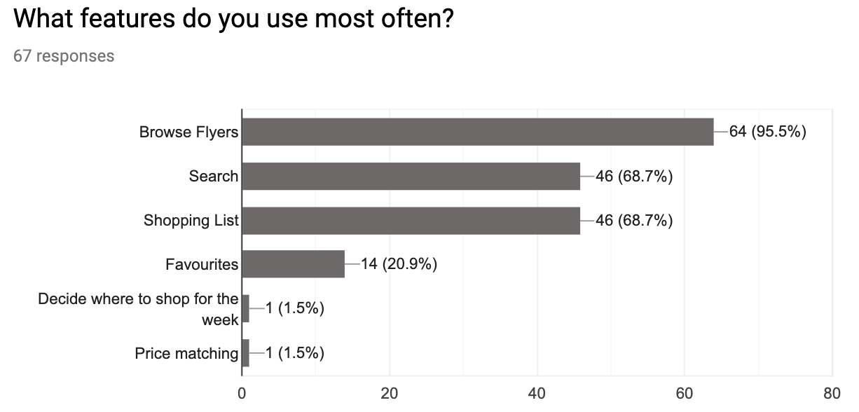
To begin, I conducted an online survey distributed through our mobile application inquiring about frequently used features and app behaviours.
In addition to the survey, I analyzed Reebee’s data analytics platform, Fabric, to validate the usage of the most-used features. These are the most-used features on reebee:
1. Browsing digital flyers from stores

64.7%

of daily users use the flyer through opening it from the bookshelf, viewing from a searched item, etc.
2. Searching for items and their best deals at different brands

83%

of interviewed users said one of the primary actions they use reebee for is searching for specific items they need.
3. Compiling a shopping list of items from flyers

2.1 million

items were added to users’ shopping lists in June 2019

Humanizing the research

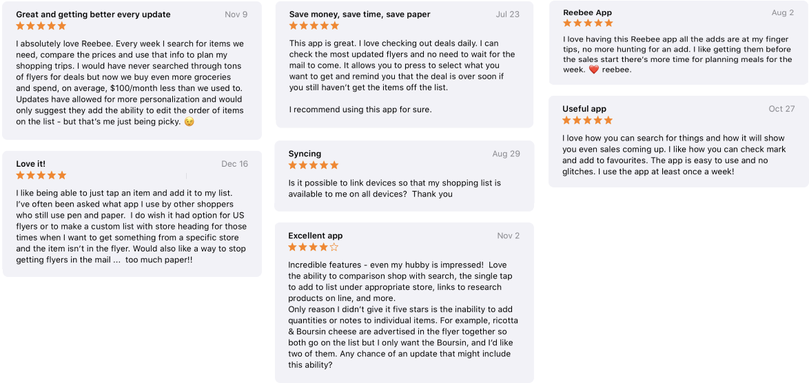
In addition to gathering quantitative data, I read through thousands of app store reviews and worked closely with our customer service team to gather qualitative insights about our usage patterns among users. This encompassed learning more about the context of how people use Reebee, seeking pain points and frustrations in the app’s workflows, and overall learning about our customers beyond the numbers.
Additional key insights
User sign-in
Our app allowed users to connect their emails to sign into Reebee, but it was a rarely used feature and hidden in our settings. It was something the stakeholders also wanted to emphasize and allowed our frequent users to access their lists from any device.
Tapping an item to add to the shopping list
Based on the quantitative data about shopping list adds, user reviews, and feedback given to our customer service team our team knew a significant user action was adding items to the shopping list, However, with the existing app actions we noticed it wasn’t uncommon for new users coming in to be unaware of the functionality.

With this in mind, we decided to implement new user tooltips as part of our onboarding strategy that would educate first-time users on key app features. This way, users aren’t left fumbling around the app and instead, can get more out of their experience, earlier.

Market research

As part of my discovery phase, and transistioning to ideation, I conducted some market research on how competitors in the space were approaching the problem. Specifically, how they chose to educate their new users on their app’s features.

The purpose of the research was to outline UX patterns used in the industry for onboarding, acting as a user of this new app, and assess their methods as a benchmark on what could and couldn’t be translated into our experience. My approach was ad hoc and involved screenshots of multiple onboarding screens used in similiar apps, grouped by appearance in the onboarding process.

In particular, I noticed a combinations of a full screen walkthrough, tooltips, product tours, customization features, and modal prompts all to convey different bits of information to the user about the app capabilities.

Design considerations and constraints

Designing for scalability
Reebee was undergoing significant product growth and had a lot of incoming changes in their roadmap. I wanted to create a process that would encompass all their new features and ensure it worked in the long run.
Low developer and designer resources
Many of the developer resources had been allocated towards feature building prior to my internship, so I had to create a design that would be feasible with the timeline and resources we had.
Redesign project in parallel
During my internship, I focused on an app refresh in addition to the onboarding process which meant lots of design and development work was split between the projects.

Wireframes

Upon doing some research on different onboarding approaches, I presented multiple wireframes to my stakeholders that focused on the end-user experience. The goal was to explore different options, which may or may not be feasible now but would be helpful to explore in future iterations as well to build our product.

By presenting various options with a mix of the methods I researched online, I gave stakeholders a glimpse into a new user perspective as well as how other products tackled the opportunity.
Option 1
In option 1, onboarding is a full-screen, interactive walkthrough and the ability to customize the app experience by pre-selecting the user’s favourite stores. It also includes a location prompt which was missing from the existing process, and a direct sign in feature our stakeholders wanted to promote in the app.
The pros to this iteration allowed for users to customize their Reebee experience, and they could perform common app functions to understand the actions when they saw it in the app later.
Option 2
Option 2 is a product tour that immediately takes the user into the app after a sign-in prompt. The blue tooltips were not a finalized design but meant to convey the product tour message. I made sure to make the tour messages small enough to give the user a glimpse into the application.
This approach required standardizing the app tooltip designs and animations in the app to keep it consistent across the platform. It could also be viewed as disrupting the user workflow as they enter the app with a mandatory product tour, which could delay their time to value and cause churn. However, a big benefit is it allows them to see the app as they learn about it.

In the end, this option was considered not scalable as the design of the application was meant to change, and whatever tooltip design and copy was finalized was not guaranteed to translate to the product 6 months later. Specifically in regards to design, functionality, and branding voice.
Option 3 (chosen)
This iteration is a full-screen walkthrough that appears right after the user downloads the app and launches it. It has accompanying engaging illustrations to emphasize brand personality right from first launch. However, users won’t get to experience the app and will have to stay engaged throughout the steps to get into the app. It also includes a pop up modal after multiple sessions for account creation.
Option 4
The final option I explored was the most straightforward, quick solution to onboarding and a common method in the industry: screenshots of the application presented in a full screen walkthrough that had explanations about app functionality. However, this proved to have the same complications as Option 2 as we weren’t sure whether the design was going to change significantly after shipping this.

Copywriting process

As the project progressed, we collaborated with our marketing team’s copywriter and customer success manager to work on the copy of the onboarding strategy. This included the text of the tooltips, full screen walkthrough, and empty state screens.

Our approach was creating a collaborative Google sheets with iterations of copy. We wanted to keep the copy concise and brand-focused.

Illustration sketches

Imagery

PART ONE:
FULL-SCREEN WALKTHROUGH

When a new user comes into our app, we want to showcase our brand and keep them engaged enough to get into the app experience so that our value proposition is emphasized.

In our customer feedback, we noticed users wanted a method to sync their shopping lists across devices. We emphasized the sign-in feature in the walkthrough to encourage users to use the sign-in functionality for syncing.

Since location was a significant factor in improving our app experience, adding a location prompt in the onboarding was needed to provide transparency for our users.

PART TWO:
IN-APP TOOLTIPS

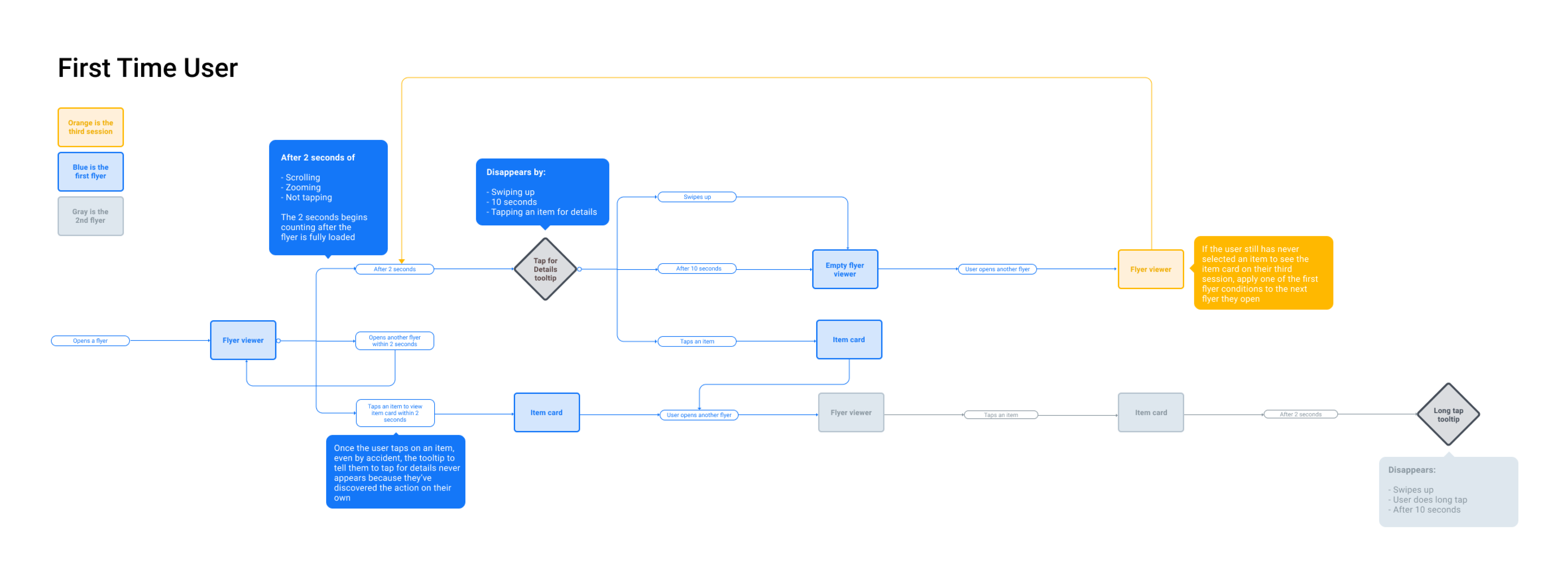
When a new user arrives in our product, we want to guide them through the core elements and get them set up so that they start to get value from the product as quickly as possible.

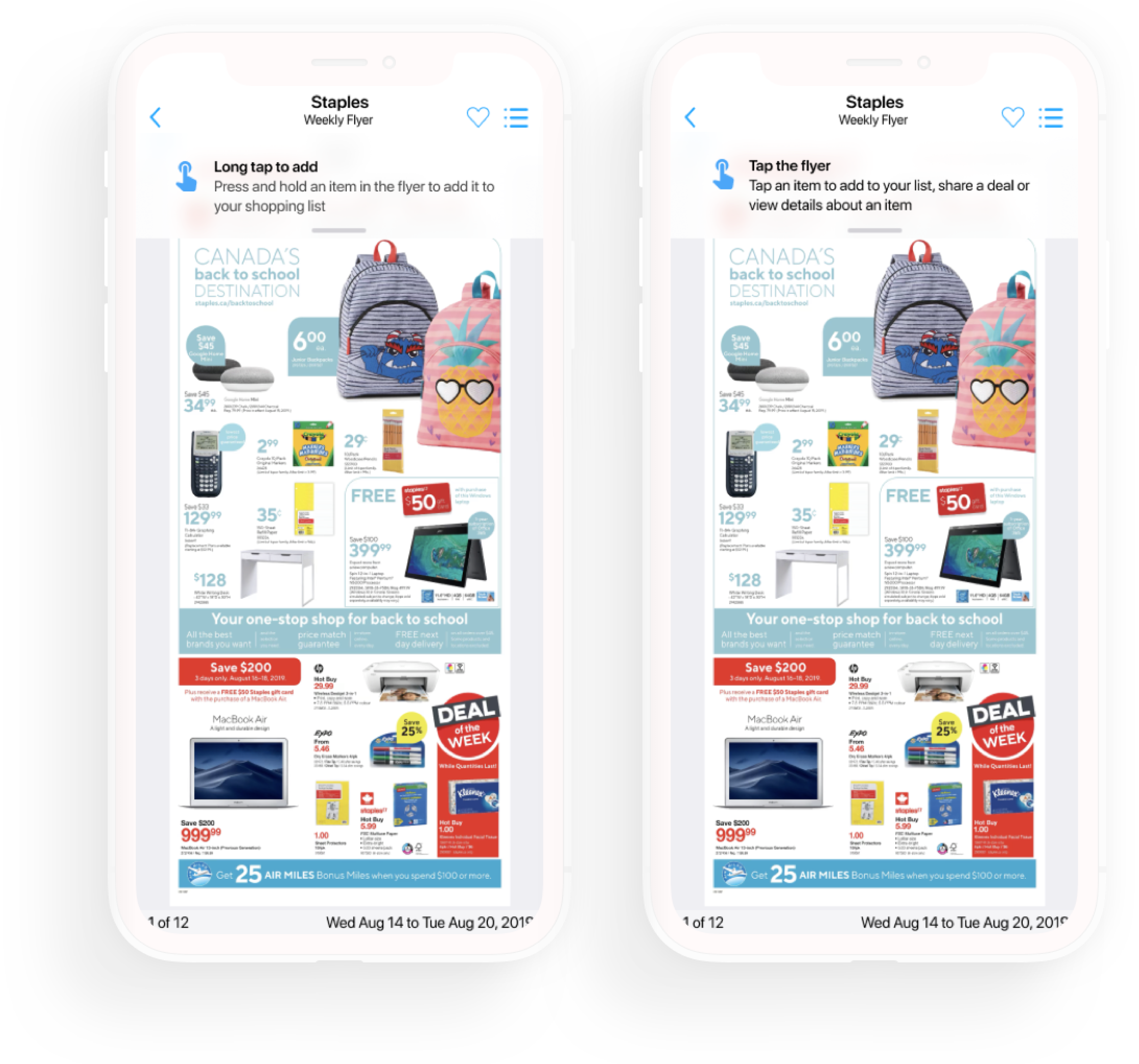
We added a new style of in-app tooltips to educate new users on key actions such as adding an item to the shopping list from the flyer and viewing product details.

After speaking with the customer service team, we learned older audiences using our app assumed the flyers were uninteractive images. With a tooltip, we hope they’ll see value in being able to clip flyer items quicker.

PART THREE:
EMPTY STATE SCREENS

The final part of this project was implementing empty-state screens to replace previously blank content in an empty shopping list, search results, and favourite stores list.

By adding actionable content and encouraging copy, we can emphasize our brand voice throughout the app and encourage users to use multiple app features.

Key performance indicators (KPIs)

Retention of users after 30 days
Percentage of users that download the app on Day 1 and open it again on Day 30.
Allow vs Don't allow location access
Percent of people who granted location permissions with an added permission priming screen.
RESULT

↑ 20%

40% > 60% on Android

↑ 3%

70% > 73% on iOS
Duration spent on each onboarding screen
Evaluating the effectiveness of the imagery + copy by quantifying how long is spent at each onboarding screen.
Number of adds to the shopping list
With an empty state screen design for an empty shopping list, we want users to be encouraged to add items to the shopping list by giving them directions how to do so. This could be a manual add (i.e. typing in an item) or adding an item from a flyer.

Next steps for the team

Personalization
In this onboarding strategy, we didn’t get the opportunity to implement a solution to encompass personalizing the app according to different user interests. In the future, I hope Reebee adds that into their user experience to become more competitive in the market.

Monitoring design engagement
Once the design has been fully implemented, we will continue to monitor the user impression of the design and visuals through the above KPIs. From the feedback, we can adjust the copy and illustration styles to cater towards more users.